Infographic Of The Day: The Best And Worst Performing Sectors Of 2020
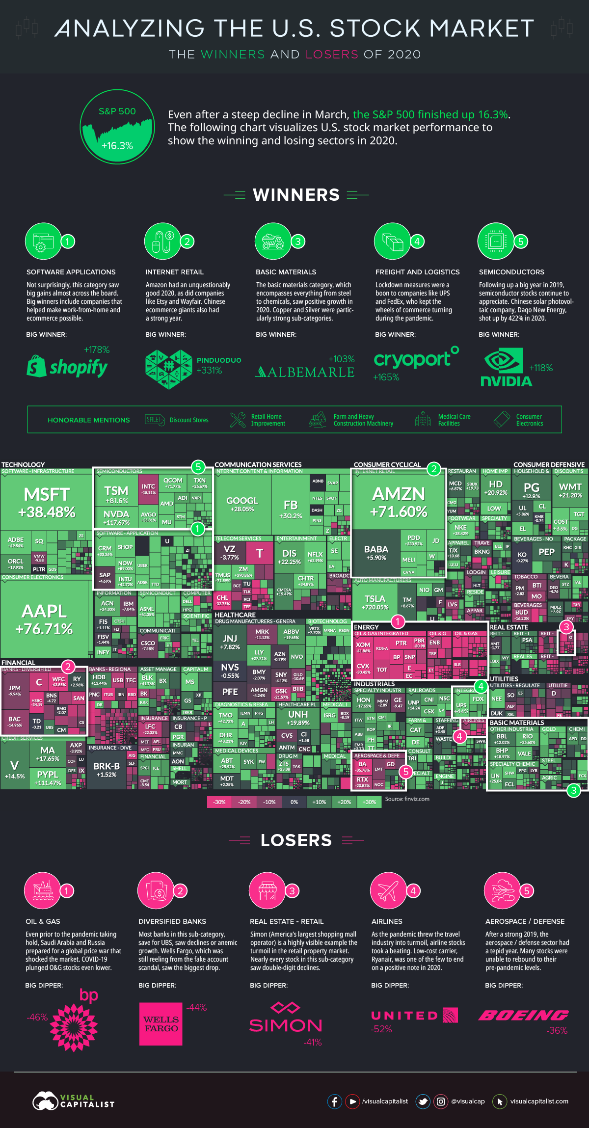
 Today's infographic uses an augmented screenshot of the FinViz treemap, showing the final numbers posted for major U.S.-listed companies, sorted by sector and industry. As you can see, the best and worst performing sectors generally fall into two categories: those that benefitted from COVID-19, and those that didn't.

No comments:
Post a Comment