by Brad W. Setser
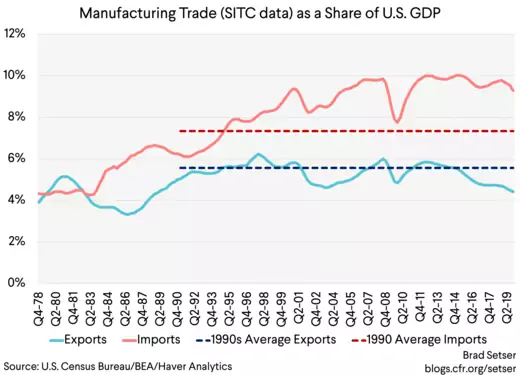
1. Globalization hasn’t meant increased demand for U.S. exports of manufactures over time…
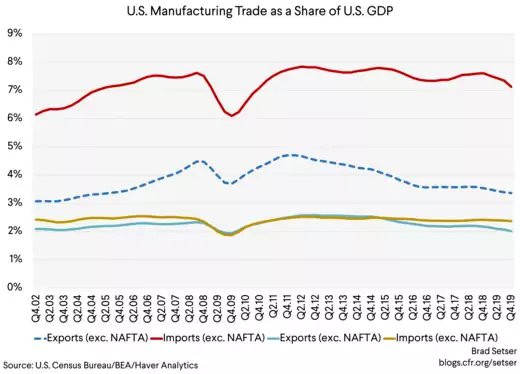
Exports of manufactures (using the SITC data from chemicals through miscellaneous manufactures) are no higher, as a share of U.S. GDP, than they were in the 1990s…
In fact, exports of manufactures are now, after the dollar's 2014 appreciation, about a percentage point of GDP below their average level in the 1990s.

Back when I first learned about trade, the usual story around gains from trade was that trade would allow the United States to specialize in advanced manufacturing, and trade its knowledge intensive goods for imported goods from the rest of the world. That isn’t the story that has played out in the data.
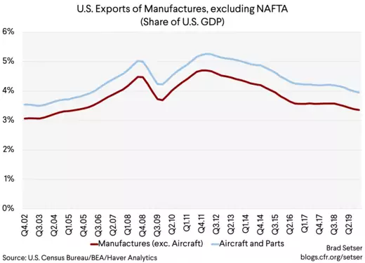
If trade with NAFTA is set aside, the broadest possible definition of U.S. manufacturing exports—using the NAICS data here, which includes a lot of food processing*—puts exports beyond North America at less than 4 percent of U.S. GDP. Around a sixth of those exports are civil aircraft, aircraft engines, and aircraft parts—and thus are in a sector that is particularly exposed to the corona virus shock.

For better or for worse (I would say mostly for worse), manufactured exports are a sufficiently small share of the U.S. economy that they really would have trouble driving a U.S. recovery.
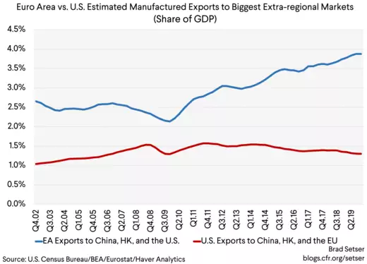
The United States’ limited extra-regional exports are also not just a function of the United States’ large size—European (EA) exports to the United States and China are now almost three times bigger than U.S. exports to Europe (EU) and China (as a share of each region's GDP). Back in 2009 and 2010, the Obama Administration liked to talk about how the U.S. recovery from the global financial crisis would be led by exports and investment.
But it turned out that Europe’s recovery was the one that was led by exports…

China's exports have come down relative to the size of its economy after the global financial crisis. But exports to the United States were about 4 percent of Chinese GDP before the trade war, and exports to Europe were around 3 percent of China's GDP. So exports to these two big markets alone exceed total U.S. manufacturing exports to the world.
2. U.S. exports of IP related services haven’t grown all that fast since the 1990s
This one surprises people. The U.S. is a service driven economy after all. And San Francisco and Seattle are home to a lot of very profitable technology companies (I used a broad definition of IP related services as well, one that includes business services to capture R&D exports).

This stylized fact also surprised me to be honest. Following the money led me into the world of corporate tax avoidance. $30 billion a year in software exports does seem to be too low, but that is what is in the reported trade data. And yes, a quarter of those exports do go to Ireland. Go figure.
I wish a tax knock-down of Apple (showing the huge share of the profit that ends up in Ireland) was as widely known as the supply chain knock down that purports to show that only a small fraction of the manufactured value-add in an iPhone comes from China (that study is out of date by the way even if the fact checkers at large newspaper haven't noticed—China now accounts for about a quarter of the manufacturing value add).
3. The dollar’s strength from 2000 to 2003 really hurt the U.S. economy—having a currency that rallies in a recession isn’t necessarily a good thing.

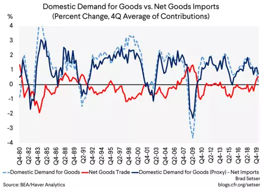
That’s what happened in the late 1990s for example. With demand growth then really strong, there was ample demand for U.S. made goods even with rising imports.

This correlation (the red line in the chart above is net goods exports and it usually moves in the opposite direction of the dotted blue domestic goods demand line; the strong blue line is a rough measure of domestic demand for U.S. goods**) leads some to argue that a rising trade deficit is generally a sign of economic strength.
But rising imports aren’t always a sign of strong demand and a booming economy.
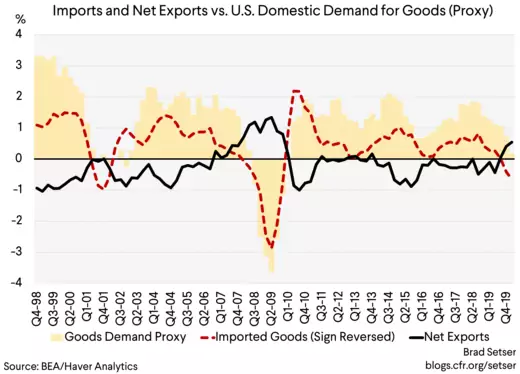
Take the period of after the dot-com crash. The trade deficit rose over this period, even when the United States economy was in the doldrums.
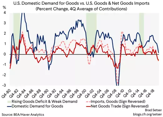
For example, the dollar’s strength from 2000 to 2003 weighed on exports and pulled in imports. In the period immediately after the dot-com crash imports of goods (the redline below) were almost as strong as they were during the dot-com boom even though U.S. goods demand was much weaker. That meant that U.S. production bore the brunt of the fall in demand for goods.

The rise in the real trade deficit in this period contributed to the jobless recovery. Goods demand rose by an average of a percentage point a year over these four years (4 percentage points cumulatively) and approximately 50 percent of that demand went to imports. That hurt, particularly as the large share of demand flowing to imports came at a time when exports weren’t growing.
Net goods trade subtracted an average of a half a percentage point from U.S. growth between 2001 and 2004—with most of the cumulative two percentage point drag coming in 2002 (the strong dollar effect) and in 2004 (likely the China shock).
In fact, goods trade was a drag on the U.S. economy in two of the last four slowdowns in domestic manufacturing demand. Goods imports didn’t fall that much when demand fell during the dot-com recession and the rise in imports then weighed on the subsequent recovery. Falling exports added to the impact of the oil investment crash in 2014 and 2015 and thus contributed to the mini recession in manufacturing.
4. Those who argue that imports from China simply displaced imports from the rest of Asia haven’t spent enough time playing with the detailed U.S. trade data.
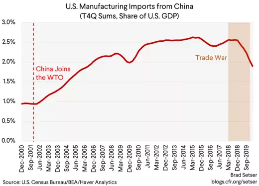
Between the end of 2002 and the end of 2006 (the “China shock” period) imports of all manufactured goods rose by about a percentage point of U.S. GDP.

The argument that China just displaced goods imports from the rest of Asia rests to a degree on a data trick—comparing imports in 2000 (well before China actually entered in the WTO, and at the peak of the dot-com boom) to imports in 2004. The 2002 to 2006 comparison is I think the much more relevant one
The China shock documented by David Autor and his co-authors was real. It also was about a percentage point of GDP, not more.

And to be clear, the China shock was much smaller than the shock from the global financial crisis—let alone the current corona virus shock.
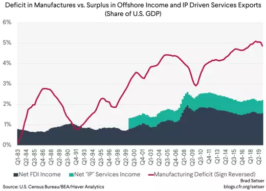
5. The big U.S. gains from globalization—setting aside the gains to consumers from lower goods prices, —have gone to those who own intellectual property that can be off-shored to a tax haven.
As I noted at the start, the past twenty-five years haven’t seen any growth in manufactured exports as a share of GDP. The same is broadly true for agricultural exports. The U.S. exports commodity crops like soybeans, wheat and corn. But the U.S. imports a lot of wine and spirits—and a lot of seafood—so overall trade in foods and feeds is pretty balanced. Nor has there been especially strong growth in exports of IP related services.
But there has been rapid growth in the offshore profits of U.S. firms—and the net income (offshore profits from U.S. firms vs. the U.S. profits of foreign firms)—over this period. And a large share of that income is now booked in global centers of corporate tax avoidance. Those who own the income streams from those offshore profits generally have done well (see Herman Mark Schwartz).
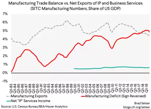
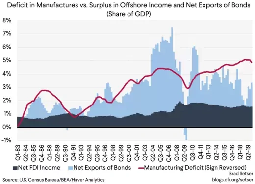
Yet the sum of offshore profits and the surplus in IP related services trade still falls short of covering the deficit in manufactures. That is especially the case after the dollar’s 2014-15 rise increased the size of the manufacturing deficit while reducing the dollar value of the profits U.S. firms earn abroad.

The books balance, basically, because the U.S. exports debt to the world.
That is again clear in the data after the one-off impact of the Tax Cuts and Jobs Act has faded (the repatriation of profits held offshore reduced U.S. foreign direct investment abroad and reduced foreign holdings of U.S. debt—this shows up clearly for example if you look at the U.S. balance of payments with Ireland).

Share
This fit here is remarkable in my view, as I have entirely left out commodities trade from the chart. U.S oil imports and exports now roughly balance, but the excess debt exports from 2005 to 2008 in the chart above were needed to cover the oil import bill at the time.
Assessments of the winners from globalization therefore need to include the owners of offshored intellectual property and the associated profits (easy enough) and those who benefit from large exports of bonds (a harder question).
All of the points above are somewhat controversial, though I believe all are also well grounded in the actual trade and balance of payments data. Persistent trade deficits do have distributional consequences (see Yakov Feygin and Dominik Leusder).
And the persistent deficit in manufacturing trade is to a degree a function of political choices both here and abroad—President Trump isn’t wrong about this, though his efforts to pin the entire deficit on bad trade deals have fallen short of the mark. His trade policy has at best offset the trade impact of his stimulus, and done so—to date—largely by driving down overall U.S. demand for manufactures rather than by raising U.S. production.
What U.S. policy choices then that have had the biggest impact on the trade balance over time? Two stand out in my view.
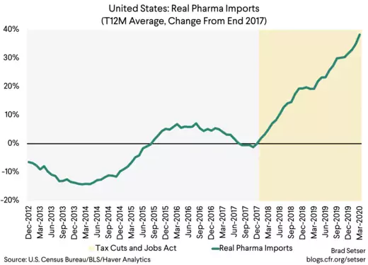
A de-industrial policy carried out through the tax code, which has long favored offshore manufacturing of high value-added components (especially in the pharmaceutical sector/hence the large goods trade deficit with Ireland). The “Ireland first” provisions of the tax code for example have contributed to the recent large rise in the trade deficit with Europe.

And failing to take effective action—which would be a policy shift with costs of its own—against large scale currency intervention (see Bayoumi, Gagnon and Saborowski for quantification) and government policies that have pushed the assets of large national pension funds abroad. The United States has in practice adopted a laissez faire approach to currency intervention—the only designation for currency manipulation in the past twenty five years was a politically motivated designation of China at a time when it wasn’t actually behaving badly in the foreign currency market. Most countries have been free to intervene to hold their currencies down without any real countervailing pressure from the United States.
Obviously relative fiscal policy stances also matter—the United States has tended to make up for weakness in private demand with fiscal policy, while Europe, Korea, Taiwan and others have not. But with overall global demand weak, I find it hard to fault the United States for excessive deficits more than the balance of payments surplus countries for running persistent twin surpluses and relying on (weak) global demand to offset their fiscal tightness.
In any case, one central feature of America' experience with globalization over the last twenty five years is that it hasn't delivered, in aggregate, a positive shock to manufactured exports. The big gains haven't gone to workers in those sectors, but rather to the owners of profits that have been shifted to low tax jurisdictions. It is time, in my view, for a debate over the policies that contributed to these outcomes—policies that go well beyond standard trade policy.
* The SITC data is a bit too narrow, but it goes back a long ways. The NAICs data is better and more detailed, but my data series only starts in 2002. The NAICs data matches the definition of manufacturing used in the monthly trade release. I did not attempt to adjust for reexports though. And the NAICS definition of manufacturing actually captures a decent amount of agricultural exports, as, for example, most pork will be exported after slaughter and show up as a pork product (processing into chops and bacon is a substantial transformation) and exports of spirits are considered a manufactured good. I did adjust for refined petrol. These differences account for the differences in levels in the charts.
** I used the NIPA contributions series for real goods trade and real demand for goods. Drawing on the insight in Bussière, Callegari, Ghironi, Sestieri, and Yamano, I added business fixed investment to goods consumption to roughly approximate domestic demand for goods
No comments:
Post a Comment