Almost as soon as the COVID-19 pandemic began, graphs and many other visualisations charting the rise of the virus started to multiply. Many show the cumulative number of deaths attributed to the virus. This number, of course, will always rise, but will also – eventually – plateau. A cumulative total can never fall.
Other published graphs have shown the number of deaths reported each day for various countries. These are more useful, but the reader is still left trying to discern the extent to which the rise from one day to the next is larger or smaller.
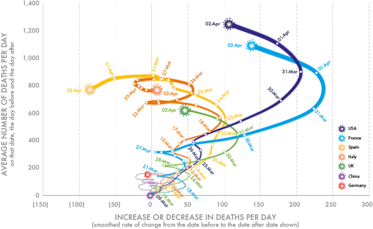
The graph below is different. It shows both the number of deaths each day and the rate of change in that number. Most importantly, it uses smoothed data – a moving average from the day before to the day after each date shown. This method of showing change is explored in my forthcoming book, Slowdown, which I worked on with illustrator Kirsten McClure who turned my crude Excel graphs into clearer visuals. It’s a useful way to look at data when it is change that is of the greatest interest.
The first graph (below) shows the rise in mortality in seven countries up until Thursday, April 2, 2020. At that point, the number of deaths was still rising every day in the US, France and the UK. The increases in mortality had begun to slow in Spain and Italy. Germany and China were reporting far lower numbers of deaths.
Mortality in seven countries attributed to COVID-19 (January 23 to April 2, 2020).
Danny Dorling/Kirsten McClure, Author provided
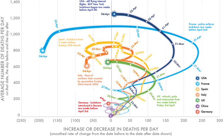
The picture began to change very markedly on Friday, April 3 and Saturday, April 4. As the graph below shows, the number of deaths in the US stayed the same (when smoothed). France was now reporting falling mortality, as was Spain and Italy. So too, for the first time, was the UK. The three-day smoothed daily number of deaths in Germany was also now falling. The graph is worth interpreting in the light of when the various national lockdowns began.
The first Boeing 737 (a 100 series) makes its maiden flight.
On his phonautograph machine, Édouard-Léon Scott de Martinville makes the oldest known recording of an audible human voice.
Mortality in seven countries attributed to COVID-19 (January 23 to April 4, 2020).
Danny Dorling/Kirsten McClure, Author provided
It is worth emphasising that both graphs above show a smoothed estimate of the number of deaths occurring on each day. This estimate is made by working out a three-day moving average of the number of deaths and it is shown on the vertical axis. The horizontal axis of the graph then shows the rate of change in that measure. Once a curve crosses to the left of the central axis, the number of deaths is falling. As I write, the number is not yet falling in the US, but it is about to.
When that graph was drawn just two days earlier, the picture it showed was less optimistic for France and the US, although even by April 2 it was evident that they too were swinging leftwards.
Reliability of the numbers
The numbers that are reported each day cannot be terribly reliable. For example, the daily tally of deaths are not those that have actually happened in the last 24-hour period, but rather the deaths that were reported in that period. In the early days of the pandemic, there were concerns about lower numbers being reported on Sundays as deaths then were not registered until Monday. Because of spending cuts, over the course of the past two decades in the UK there was an increase “in the median delay between occurrence and registration for deaths registered by a coroner from five days in 2001 to 18 days in 2018”.
In recent weeks, the registration of deaths has hopefully been faster than this; but additionally, the definition of what a death associated with COVID-19 is, has changed over the preceding weeks. The sources of data, however, tend to be very similar, including the data used here.
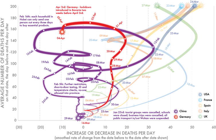
Because the numbers of deaths that have occurred in China and Germany are so much lower than in other countries, the graph below highlights this data. Mortality began to fall in China by February 14 and in Germany by April 2. However, wherever mortality falls it can rise again, as is shown by the various loops in China.
Mortality in China and Germany attributed to COVID-19 (January 23 to April 4, 2020)
Danny Dorling/Kirsten McClure, Author provided
While all the graphs above show that the rise in the number of deaths per day from COVID-19 may be abruptly slowing, they don’t confirm that this trend will continue. It has almost certainly been the social distancing measures put in place that have resulted in each of these seven trends altering as and when they did.
As modellers know all too well, the number of cases could conceivably rise again – and China appears to be the only country that has so far fully brought the novel coronavirus under control. On April 6, for the first time since January 2020, China reported no new COVID-19 deaths.


No comments:
Post a Comment