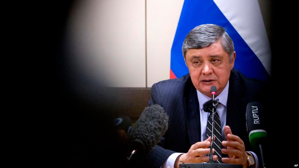
New Delhi is also worried that the Afghan conflict has been caught up in the current tensions between Russia and the United States.
New Delhi: India on Thursday said it would participate in “all formats of talks” on discussing a solution for peace in Afghanistan, setting off speculation that New Delhi could formally share the table with the Taliban in talks among all stakeholders in future. New Delhi also said it hoped the Afghan presidential elections would be held as per schedule.
“We will participate in all formats of talks (on Afghanistan)”, the MEA spokesperson said.


/65.11717956250004,33.701800898491875,4/421x337.png?access_token=pk.eyJ1IjoiZGFsdG9ud2IiLCJhIjoiOWdSSXFQSSJ9.HZyjh4g3TAAOAncwelv9Vw)


/arc-anglerfish-arc2-prod-mco.s3.amazonaws.com/public/IFQFO6N6UZCULLA54H7KYY77PY.jpg)


/arc-anglerfish-arc2-prod-mco.s3.amazonaws.com/public/MFMCWIPE7VGLHM3VELXWHTTVKA.jpg)